A health-tech company from Bajaj Finserv group.
Disrupting the health care industry. It’s more than an app or a website. It’s a personalised health manager
Boosting Doctor Visibility and Simplifying Patient Decisions

YEAR
2023-24
DOMAIN
B2C
Product growth
PRODUCT OWNERSHIP
Prerna Bajaj
MY ROLE
Product Designer
TEAM
2 PM, 8+ Engineers 2+ Data Analyst
Problem Statement
Patients often struggle to make informed decisions when selecting a healthcare provider due to the overwhelming amount of information and the complexity of comparing different doctors. This leads to increased cognitive load and delays in decision-making, potentially affecting their health outcomes.
Information Overload
Complex Comparisons
Delayed Decision-Making
Increased Cognitive Load:
Goal & Objective
Our goal is to enhance the visibility of doctors and streamline the decision-making process, enabling users to quickly and easily choose a doctor based on their specific health conditions and preferences.
Enhance Visibility of doctors
Streamline the decision making process
Add Social Proofing for easy decision making


My Design Process
Define
Knowing how to minimise the information and yet keep it to ease decision making
Solution & Iteration
Knowing how to minimise the information and yet keep it to ease decision making
Implementing and testing out
Realising to also make a better experience for users but at the same time to also grow business
Identifying the Problem Areas through
To understand where users were encountering difficulties, I conducted a comprehensive analysis of the B2C journey. This involved:
1
Screen Analysing
We closely examined the screens in the doctor appointment journey to identify points of friction and areas where users struggled to make decisions.
2
User Journey Mapping
We mapped out the entire journey users take when searching for and selecting doctors, from landing on the website to making an appointment.
PROBLEM IDENTIFICATION
Analysing existing screens
To start, I began by mapping out the B2C journey to pinpoint the exact moments where users face difficulties in selecting doctors. By thoroughly analysing the screens involved in the doctor appointment process, I identified key areas for enhancement to streamline, simplify the decision-making experience and reduce cognitive load for patients.
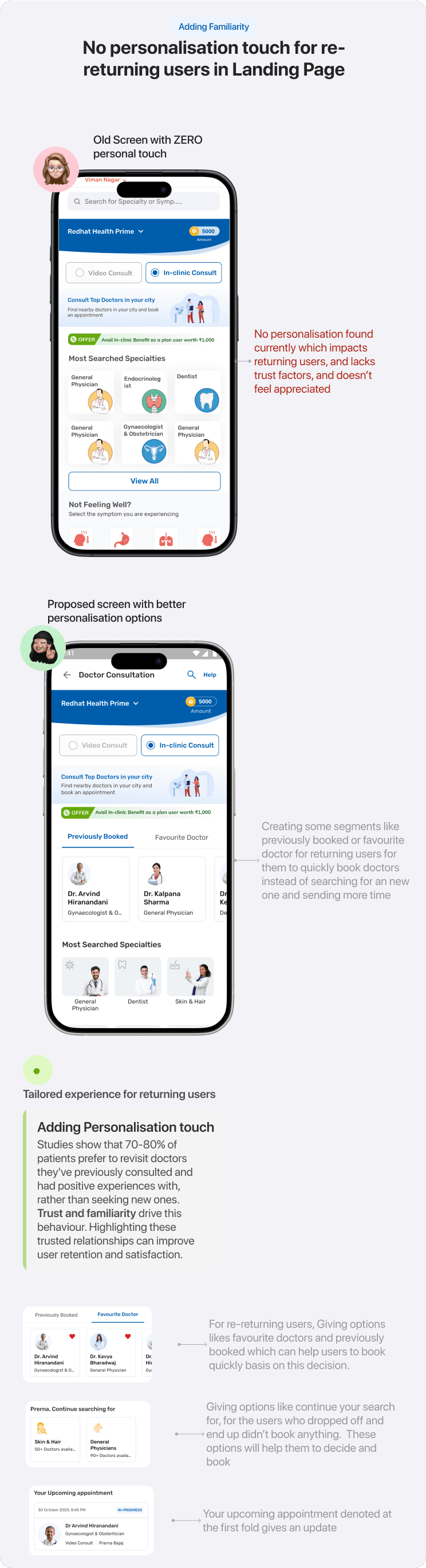
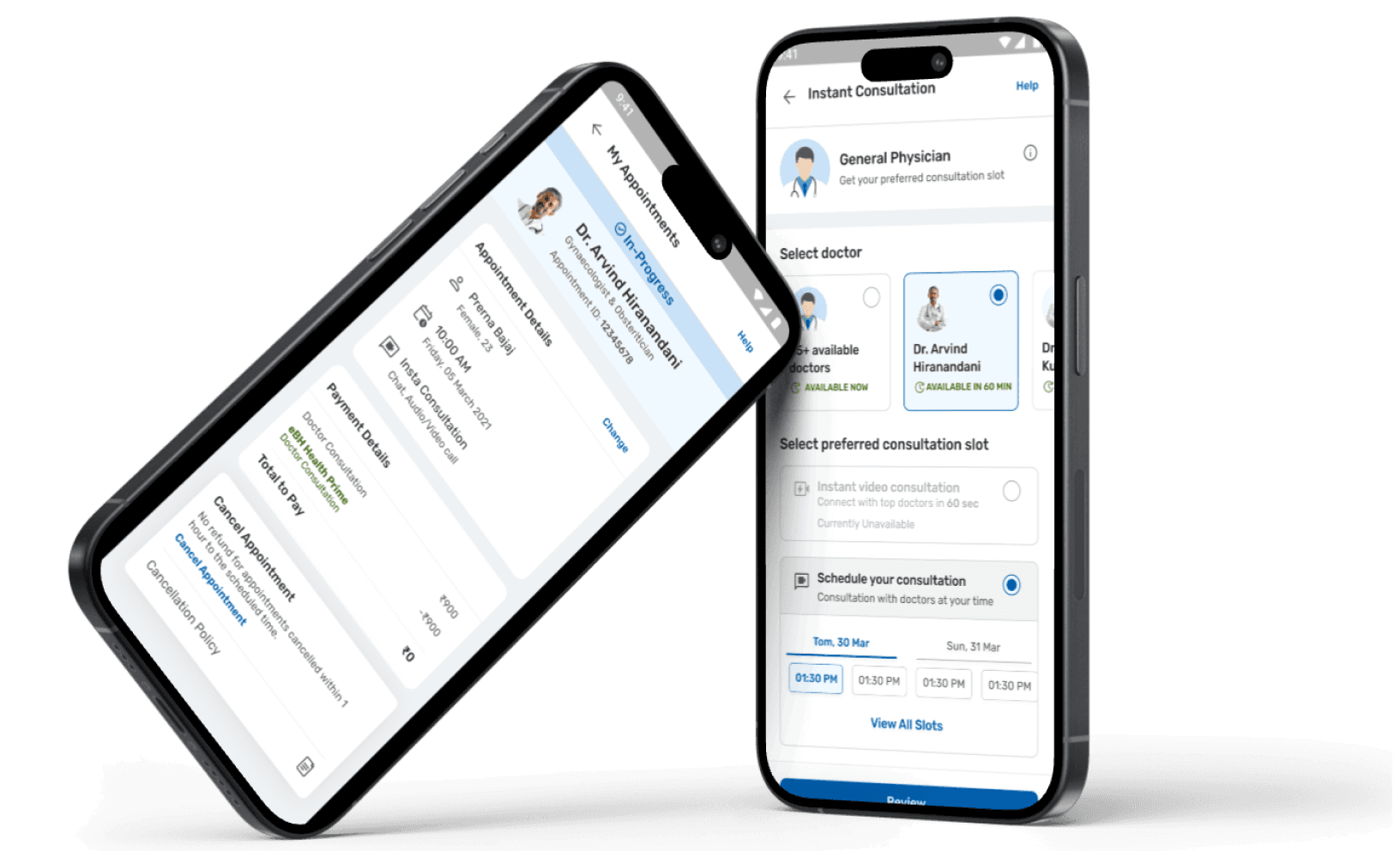
Landing Screen for Doctor Consultation
Deciding consultation type
Basis of speciality of doctor
Basis of symptoms
Landing Page:
User lands on doctor booking landing page to look out for doctors.
Gets two types of consultation services, multiple doctor options basis on speciality or symptoms.
List of doctors according to the selected speciality
Lack of Social Proof
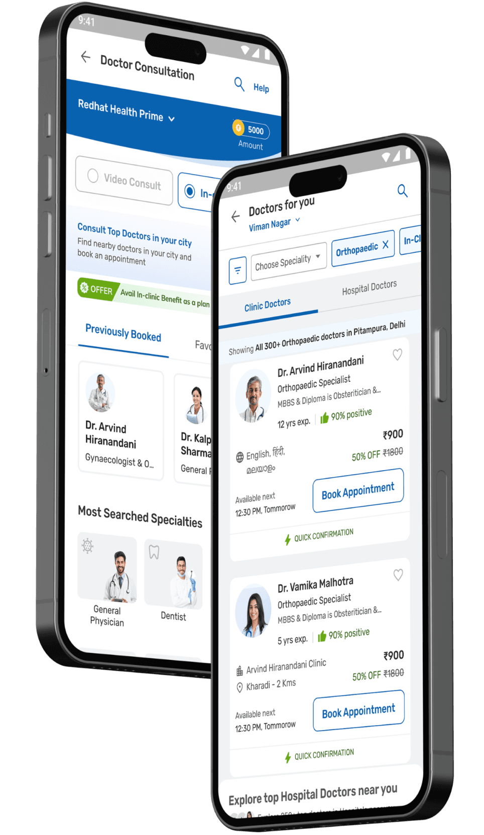
Listing Page for Doctors

Listing Page:
User selects one speciality of doctor and lands on listing page consisting list view of multiple doctors to select for
The doctor details are there in a card format which makes the decision factor for a patient for consultation.
Journey of users:
FINDING GAPS
User Psych Level
By observing users as they navigated through the screens, I noticed where they got stuck, disappointed, or confused during the doctor booking journey.
Mapping their emotions and psychological responses provided clarity on the major gaps and problems, guiding the identification of key areas for improvement.
Psych Level
Landing Screen
Listing Screen


USER INTERVIEW
Conducted an interview with 8+ users
I knew it was important for me to understand users first to know what and how they look out when booking a doctor consultation. Thus, I started preparing the questionnaire for the users according to the categories i jotted down.
General Experience?
Can you describe your overall experience when searching for and selecting a doctor online?
What are the most important factors you consider when choosing a doctor?
Landing Page
How do you usually start your search for a doctor? What information do you look for on the landing page?
Is there anything you find confusing or difficult to navigate on the landing page?
Doctor Listing Page
When viewing the list of available doctors, what information do you find most helpful?
How do you feel about the current filtering options? Are there any filters you wish were available?
Decision-Making
What information helps you make a quick decision about which doctor to choose?
How important are ratings and reviews in your decision-making process?


Research Findings

Why do we have so many options with the category of doctors? There are so many options and not enough guidance.

I find it helpful when the listing shows the doctor's specialty and their location clearly, but I wish there were more filter options.

I trust other patients' feedback more than just the doctor's credentials.

I only need the doctors near to my home so that i can consult them easily, while it doesn’t allow me to show the nearest first

All i want to decide is a trusted doctor, how will i know this doctor is good and trusted one?

I am not able to understand which doctor should i consult with
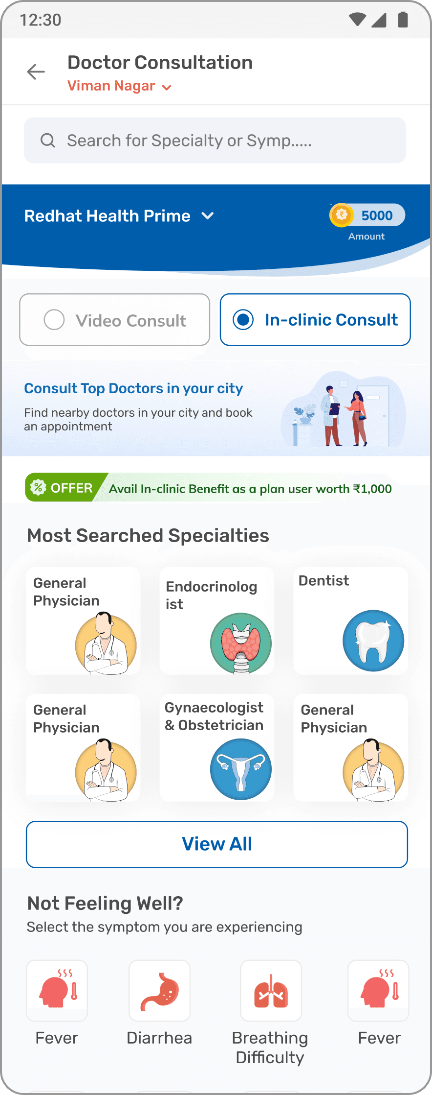
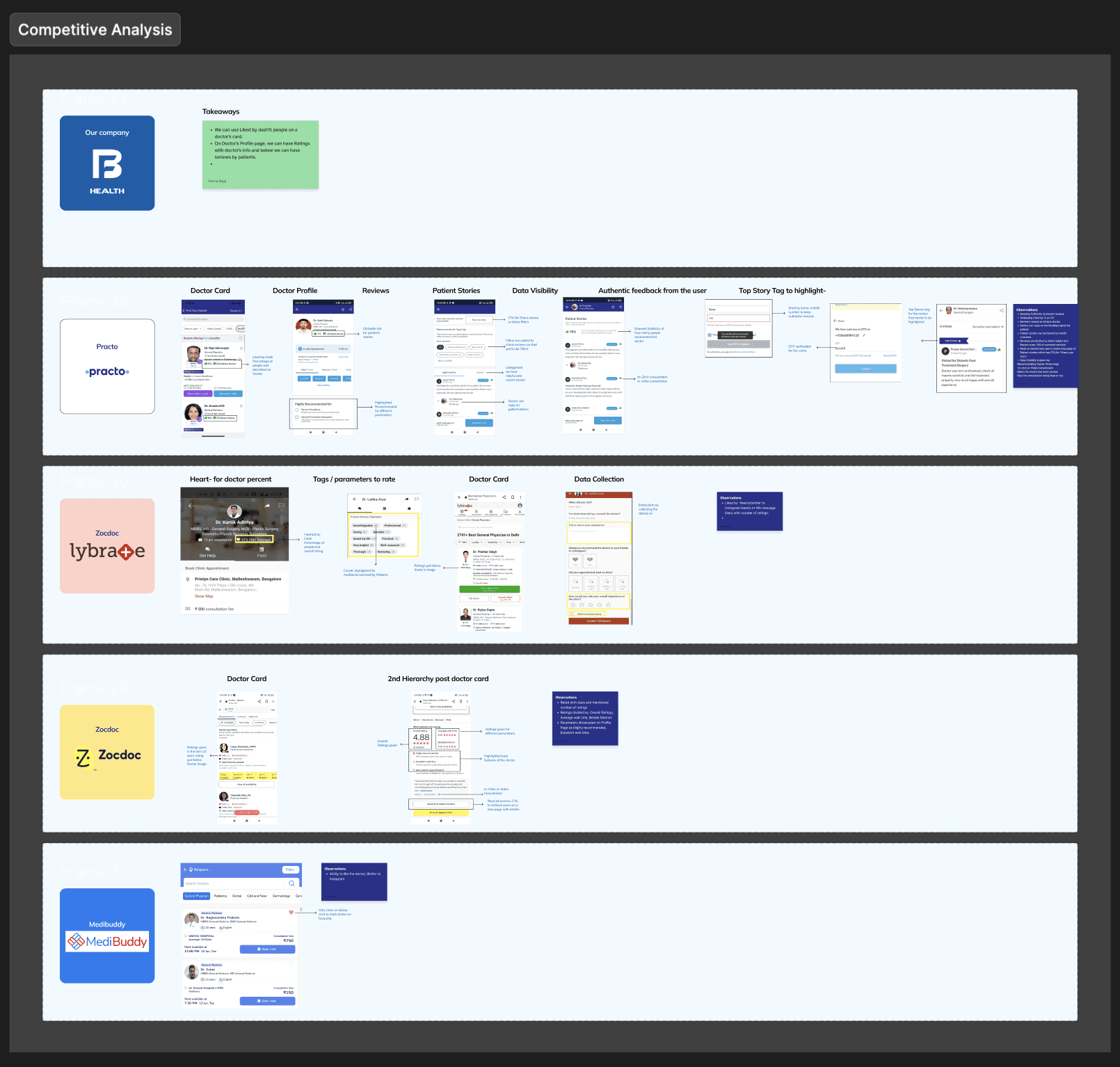
Understanding Competitors
Competitor Analysis
For competitor analysis, look at leading healthcare platforms and services that offer similar functionalities. Examples include:


Social Proofing


Prioritising experience


Filtering out the options for users
IDEATING
Ideating
Based on my research insights, I began ideating ways to enhance the visibility of doctors to patients and streamline the decision-making process, making it quicker and easier for patients. I listed down what are some main problems i need to solve on and ideate on
No easy filtering while searching out for doctor
No trust factor decision, no public ratings or review
No option for users to choose between the type of doctor they want to consult with
Lack of personalisation for returning users
AREAS TO WORK ON
Problem Statement
After analyzing and identifying pain points through research, I defined the key issues that most users faced. I then grouped these pain points by their impact on the visibility of doctors, aiding users in their decision-making process.

High Impact

Medium Impact

Low Impact
Adding Ratings and Review in doctor cards
Adding Filters in Doctor Listing Page
Merging Hospital doctors and Clinic Doctors in Doctor Listing Page
No personalisation touch for re-returning users and proper IA structure of Landing Page
UNDERSTANDING PSYCHOLOGY
Guiding psychology
Imagine yourself as a user which in this scenario is a patient, would you like to wait or take extreme time to get yourself treated? No right! Then why to make a patient’s journey so complicated for them to give extreme cognitive load to decide on to which doctor to consult.

Cognitive Load
Hick’s Law

Easy decision making
Intuitive experience
FINAL DESIGNS
Drum Rolls!
Let’s Get into the Designs


2
Ratings and Review Visibility on Doctor Cards
The Power of Social Proof
Ratings and reviews on a doctor card are crucial as they leverage social proof, building trust and confidence.
Positive feedback reassures users about the quality of care, making them more likely to book an appointment and improving overall satisfaction.
Showing positively
Ratings and reviews for doctor consultations are crucial because they reflect the quality of care provided during challenging times.
To show empathy and maintain positivity, we present doctor ratings as percentages rather than simple likes or dislikes. This approach highlights the overall satisfaction and instills confidence in patients seeking care.
1
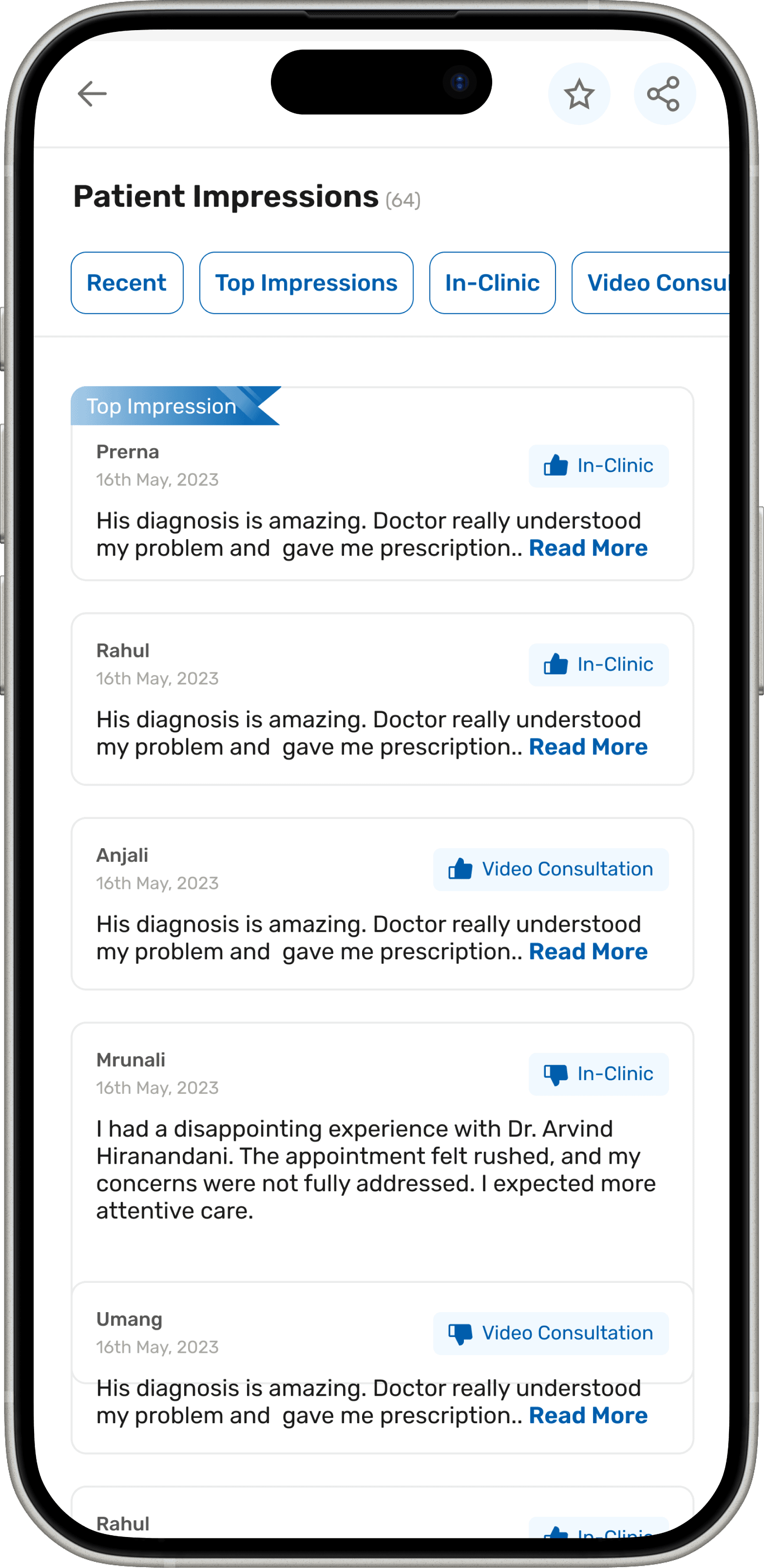
Ratings and Review Collection
Collecting real time reviews
Collecting ratings and reviews for doctor consultations is important because it provides valuable feedback, builds trust, and enhances transparency.
These content in chips were predefined through all the research that we did and placed only those out of which we needed more data or insights of
Displaying ratings and review also on doctor profile page where all the details of the doctors are there
Reviews can be visible of that particular doctor on doctor profile page. Patients can browse all the details of the review on doctor’s profile.

All of that for this final design!
Adding Social Proofing
Ratings & Review

Navigating the 'paradox of choice' (decision fatigue) which recognises that lots of options lead people to feel powerless and frustrated because choosing one among many other options means giving up the rest of the opportunities
Users lacked quick access to ratings and reviews, which are crucial for making informed decisions. I tried incorporating ratings and reviews directly into the doctor cards, enabling users to quickly assess doctors based on feedback from other patients.

Conducted direct & indirect competitor benchmarking

Conducted Surveys
While booking a doctor consultation, what all things will be crucial in making the decision of choosing a doctor for you?
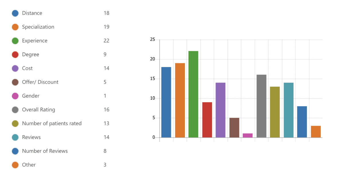
Among the following rating parameters, which parameters can influence your decision the most while booking, if shown upfront?

How much do you trust the ratings and reviews provided by other users on the platform?

Iterations time with AB Testing

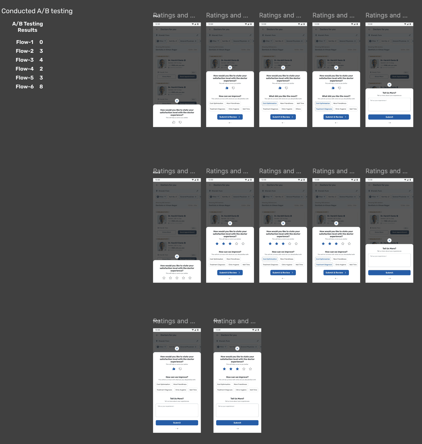
I started by doing plenty of primary and secondary research which helped me to understand how Ratings and Review is important for users to make a decision on. I conducted secondary research, primary research by conducting surveys, created multiple UX iterations and even conducted AB testing.


1
Segregating offerings for better decision making
Showing Clear Options
Showing clear options to users of 2 different type of business offerings, can help them segregate their needs in a simpler way and decide fast.
A simple approach to this is to keep an Tab approach where they can easily switch between the offerings and yet consciously deciding their needs
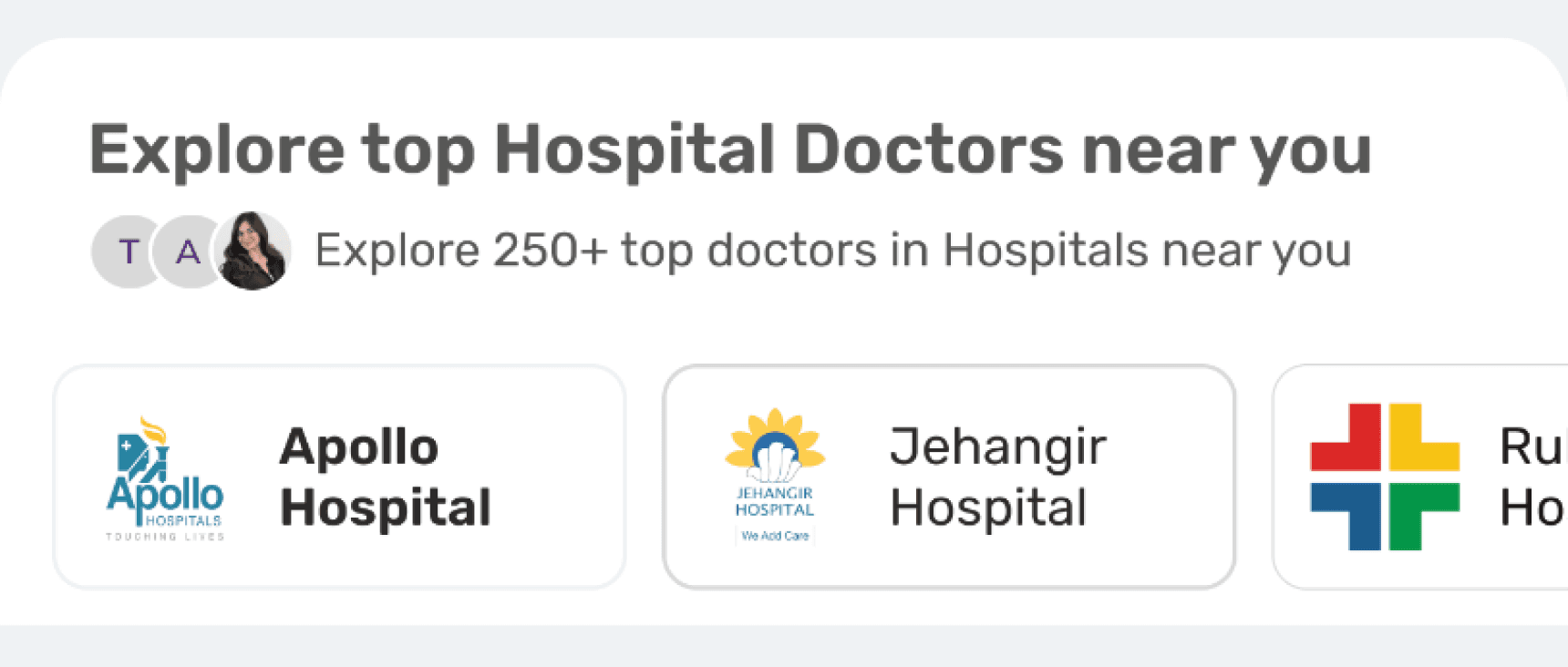
A Explore Hospital section for the users to explore other hospitals if they decide to consult this type of doctors.
Clinic Profile Page
Clinic Listing screen
Easy division of data
Bifurcating Business Offerings- Hospital Doctors & Clinic Doctors
Reducing Decision Fatigue
Filter Enhancement
Filters in doctor consultation are purely decision based,
Thus i conducted various methods to analyse which filters to use.
User Interviews and Surveys
Competitor Analysis
Data Analysis
Core Filters
Speciality
Location
Availability
Secondary Filters
Language
Gender
Experience
Consultation Type
Tertiary Filters
Hospital doctors
Clinic Doctors
Fees
Distance
Final Designs for Filters

Doctor Consultation Filters- Details
In bottom sheet drawer
Filter
67 Doctors found
Sort By
1
Specialities
Mode of Consultation
Distance
Gender
Availability
Fee
Experience
My Health Plan
Recommended
Price: Low - High
Experience: Most experienced first
Distance: Nearest first
Submit
Apply Filter
Filter
67 Doctors found
Sort By
Specialities
2
Mode of Consultation
Distance
Gender
Availability
Fee
Experience
My Health Plan
Search for Symptoms
Anaesthesiology
Audiology
Ayurveda
Cardiology
Dentistry
Nutrition
Endocrinology
ENT
Submit
Apply Filter
Filter
67 Doctors found
Sort By
Specialities
Mode of Consultation
1
Distance
Gender
Availability
Fee
Experience
My Health Plan
Video Consultation
In-Clinic Consultation
Both
Submit
Apply Filter
Filter
67 Doctors found
Sort By
Specialities
Mode of Consultation
Distance
Gender
Availability
Fees
Experience
1
My Health Plan
0-5 years
6-10 years
10+ years
Any
Close
Apply Filter
Learnings
Designing especially for health tech industry, I realised the users on the platform are looking for a service which is essential for anyone and that is health, hence they would like to browse through a product which enables and ensures trust in them.
Users appreciate products which reduce cognitive load and make it easier for them to decide on what they want instead if getting lost in the app which discourage them to use the product.
Understanding users can solve half of the problems. You know what this problem is about, you research, ideate and solve it.
Giving a sense of personalisation to the users who are loyal to us, will stick with us in long run. Making users feel like we know their needs and demands and full filling them is equivalent to growing their trust and loyalty.

Impact after design implementation
The success metrics after these improvements went live showed a significant impact on the business. I realized how even a few simple enhancements and major innovations can drive change. Some stories are straightforward, like ensuring a smooth journey for patients booking a doctor. As simple as it sounds, I discovered that a happy user equals a happy business.
30%
the 4% utilisation went up to 30% utilisation for deciding the doctors.
Filter Revamp
45%
Earlier ratings and review usage was only 36% which went up to 45%
Increase Ratings and Review
50%
Conversion rate from Landing screen to listing went up directly to 50%
Increase in conversion rate
Reduced Cognitive Load which helped users to decide on doctors easily
Reduced Cognitive Load
Thank you for scrolling through the entire project :)
Watch next project
Let’s create something
together
Amazing
I'm open to engaging conversations, exciting collaborations, or even a game of badminton! Feel free to connect for discussions or any new opportunities you have in mind.
Lets Connect
Made with Love, Good Music, Procrastination, & Tears
Copyright© 2024 Prerna Bajaj. All rights reserved.
A health-tech company from Bajaj Finserv group.
Disrupting the health care industry. It’s more than an app or a website. It’s a personalised health manager
Boosting Doctor Visibility and Simplifying Patient Decisions
YEAR
2023-24
DOMAIN
B2C
Product growth
PRODUCT OWNERSHIP
Prerna Bajaj
MY ROLE
Product Designer
TEAM
2 PM, 8+ Engineers 2+ Data Analyst
Problem Statement
Patients often struggle to make informed decisions when selecting a healthcare provider due to the overwhelming amount of information and the complexity of comparing different doctors. This leads to increased cognitive load and delays in decision-making, potentially affecting their health outcomes.
Information Overload
Complex Comparisons
Delayed Decision-Making
Increased Cognitive Load:
Goal & Objective
Our goal is to enhance the visibility of doctors and streamline the decision-making process, enabling users to quickly and easily choose a doctor based on their specific health conditions and preferences.
Enhance Visibility of doctors
Streamline the decision making process
Add Social Proofing for easy decision making

PROBLEM IDENTIFICATION
Analysing existing screens
To start, I began by mapping out the B2C journey to pinpoint the exact moments where users face difficulties in selecting doctors. By thoroughly analysing the screens involved in the doctor appointment process, I identified key areas for enhancement to streamline, simplify the decision-making experience and reduce cognitive load for patients.
Landing Screen for Doctor Consultation
Deciding consultation type
Basis of speciality of doctor
Basis of symptoms
Landing Page:
User lands on doctor booking landing page to look out for doctors.
Gets two types of consultation services, multiple doctor options basis on speciality or symptoms.
Listing Page for Doctors
Lack of Social Proof
List of doctors according to the selected speciality
Listing Page:
User selects one speciality of doctor and lands on listing page consisting list view of multiple doctors to select for
The doctor details are there in a card format which makes the decision factor for a patient for consultation.
List of doctors according to the selected speciality
FINDING GAPS
User Psych Level
By observing users as they navigated through the screens, I noticed where they got stuck, disappointed, or confused during the doctor booking journey.
Mapping their emotions and psychological responses provided clarity on the major gaps and problems, guiding the identification of key areas for improvement.
Psych Level
Landing Screen
Listing Screen
Journey of users:
My Design Process
Define
Knowing how to minimise the information and yet keep it to ease decision making
Solution & Iteration
Knowing how to minimise the information and yet keep it to ease decision making
Implementing and testing out
Realising to also make a better experience for users but at the same time to also grow business
Identifying the Problem Areas through
To understand where users were encountering difficulties, I conducted a comprehensive analysis of the B2C journey. This involved:
1
Screen Analysing
We closely examined the screens in the doctor appointment journey to identify points of friction and areas where users struggled to make decisions.
2
User Journey Mapping
We mapped out the entire journey users take when searching for and selecting doctors, from landing on the website to making an appointment.
USER INTERVIEW
Conducted an interview with 8+ users
I knew it was important for me to understand users first to know what and how they look out when booking a doctor consultation. Thus, I started preparing the questionnaire for the users according to the categories i jotted down.
General Experience?
Can you describe your overall experience when searching for and selecting a doctor online?
What are the most important factors you consider when choosing a doctor?
Landing Page
How do you usually start your search for a doctor? What information do you look for on the landing page?
Is there anything you find confusing or difficult to navigate on the landing page?
Doctor Listing Page
When viewing the list of available doctors, what information do you find most helpful?
How do you feel about the current filtering options? Are there any filters you wish were available?
Decision-Making
What information helps you make a quick decision about which doctor to choose?
How important are ratings and reviews in your decision-making process?
Research Findings
I find it helpful when the listing shows the doctor's specialty and their location clearly, but I wish there were more filter options.
I trust other patients' feedback more than just the doctor's credentials.
All i want to decide is a trusted doctor, how will i know this doctor is good and trusted one?
I am not able to understand which doctor should i consult with
I only need the doctors near to my home so that i can consult them easily, while it doesn’t allow me to show the nearest first
Why do we have so many options with the category of doctors? There are so many options and not enough guidance."
Understanding Competitors
Competitor Analysis
For competitor analysis, look at leading healthcare platforms and services that offer similar functionalities. Examples include:
Social Proofing
Prioritising experience
Filtering out the options for users
IDEATING
Ideating
Based on my research insights, I began ideating ways to enhance the visibility of doctors to patients and streamline the decision-making process, making it quicker and easier for patients. I listed down what are some main problems i need to solve on and ideate on
No easy filtering while searching out for doctor
No trust factor decision, no public ratings or review
No option for users to choose between the type of doctor they want to consult with
Lack of personalisation for returning users
AREAS TO WORK ON
Problem Statement
After analyzing and identifying pain points through research, I defined the key issues that most users faced. I then grouped these pain points by their impact on the visibility of doctors, aiding users in their decision-making process.
High Impact
Medium Impact
Low Impact
Adding Ratings and Review in doctor cards
Adding Filters in Doctor Listing Page
Merging Hospital doctors and Clinic Doctors in Doctor Listing Page
No personalisation touch for re-returning users and proper IA structure of Landing Page
UNDERSTANDING PSYCHOLOGY
Guiding psychology
Imagine yourself as a user which in this scenario is a patient, would you like to wait or take extreme time to get yourself treated? No right! Then why to make a patient’s journey so complicated for them to give extreme cognitive load to decide on to which doctor to consult.
Cognitive Load
Hick’s Law
Easy decision making
Intuitive experience
FINAL DESIGNS
Drum Rolls!
Let’s Get into the Designs